A few days ago, I visited the Xamarin.com website and noticed this. The word "Pricing" looks like "Prioing."

It's not an illusion. It looks wrong in Google Chrome. See this zoomed-in shot.
Here's the same menu in IE. Note the subtle"bites" that have been taken out of the g and s, but the c is OK. The hinting is OK, but the font is somehow "wrong."

I emailed support@xamarin, and mentally blamed Google Chrome as it's well know they've been having trouble with their Web Font rendering of late. In fact, Jin Yang (@jzy) had to abandon Montserrat, our Web Font of choice, for a more conservative one whilst doing the Hanselman.com redesign due to Google Chrome's poor font rendering on Windows. (It's lovely on Mac.)
I also happened to be at the Xamarin Evolve conference this week, so I mentioned it to the team down there, thinking they could pick another font.
Fast forward, and I'm on the plane, checking my email with Gmail Offline (the HTML5 offline version of Gmail) and noticed this.
These fonts look like crap too!

What's going on here? What's changed? Doesn't it seem like "What's changed?" is the question we engineer-types ask the most?
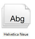
Well, what's changed is that I gave a talk at Xamarin Evolve this week, and in preparation, installed Helvetica Neue. It's a lovely font and I think it worked nicely for my talk and looked great in PowerPoint.

However, Helvetica is super common font that is mentioned in Stylesheets - often explicitly when CSS is designed on a Mac - and Arial on Windows usually steps in as the replacement on Windows.
The Helvetica Neue font that I installed for my presentation is very poorly hinted (if at all) at small sizes like the one's being used. It's just not a Web Font, and while it's great for the giant sizes I needed for my talk, it's lousy for the web.
Both IE and Chrome were picking up that my system had a Helvetica available on the system and used it instead. The Stylesheet said "hey, gimme Helvetica" and the browser said "Cool, here's one."
While it's obvious it would have major effects in retrospect, I had never realized that a machine-wide "common" font installation like this could mess up font rendering in my browser. I think the best solution (even though I'm deleting Helvetica Neue) would be to use an explicit Web Font in your stylesheets when possible rather than relying on a system font like Helvetica, even though they are the ultimate fallback. Any designers want to weigh-in the comments?
Here's Chrome now on Windows with Helvetica Neue removed:

And IE

I hope this post helps someone who might bump into this font issue. My sincerely apologies to the lovely Xamarin employees who took my "bug" seriously! Thanks to Damian Guard for his Font insight!
© 2013 Scott Hanselman. All rights reserved.
_thumb.png)


