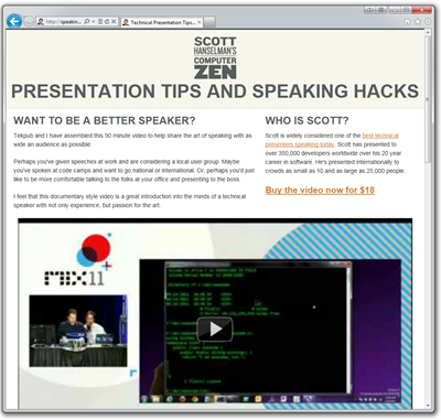
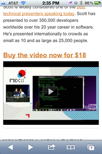
 I recently did a video with Rob Conery on how to be a better technical speaker and blogged about it. I wanted to put up a site for this video to give people more details and to make it easier for me to get the word about about the video separate from Tekpub. I went and bought http://speakinghacks.com and fired up WebMatrix to do a quick one-pager.
The idea was to spend only an hour on this from the moment I got the domain to a "complete" site. My requirements were:
- An easy to remember domain name.
- Check. SpeakingHacks.com
- A site that looks kind of like my existing site, to keep the branding cohesive.
- Cool I've got some existing CSS.
- Site should look good on mobiles and tablets so I want to use responsive design.
- Um...
- A site that includes the free trailer for my video that plays on any device, including phones and tablets.
- Um...
- A site that resizes cleanly, rotates cleanly and the video thumbnail is always as large as possible.
- Um...
First step, a decent starter template that works on Mobile
For stuff like this, I now always started with a decent boilerplate. There's even group knowledge and experience that there's little reason for me to New Blank HTML File these days.
There are a number of options out there, including two of my favorites:
- Skeleton - Uses a 960-style grid but scales down to a phone
- Initializr - Takes a mobile-first approach, although ironically their own site doesn't use their template. ;)
There's others, and the nice thing is that you can get started with a template like this in minutes, not hours, so go find one that makes you happy.
I picked Skeleton, then with a little magic help from Jzy and a late night Skype (go visit his http://programmerryangosling.tumblr.com site, by the way!) we brought in a few elements from my currently blog template so the general look and feel is still there.
Add a YouTube video
There's a number of ways to embed a video that will use Silverlight or Flash if HTML5 video isn't available, including
- VideoJS - A really nice and image-free HTML5 video player with a series of templates that can make it look like Vimeo or YouTube or others. Works everywhere.
- SublimeVideo - Free and pretty but they have a few sign up things if you serve hundreds of thousands of views.
- jMediaelement or "jme" - Clean, basic, simple, open. Flash fallback and semantic code.
These are all great but if you've already got your video up on YouTube, Vimeo, Blip or another video sharing site, you might just want to make that existing video embed resizable.
For that, you can use FitVid, a small jQuery plugin that will take effectively any video element and make it resizable and usable in a responsive design.
Originally Rob was using a Flash player called Flowplayer but I recommended that he save money by serving his video trailers on YouTube. That meant that I could serve my trailer video from YouTube. While I could then use the FitVid JavaScript to make the video resizable, it seemed like overkill to use some JavaScript to resize something that CSS should be handling for me.
Enter A List Apart and their article on Intrinsic Ratios for Video. The hardish part about resizing a video is maintaining the ratio, like 16:9 for example. As they say:
padding-bottom: 56.25%To create a 16:9 ratio, we must divide 9 by 16 (0.5625 or 56.25%).
Anders M. Andersen has a nice clean example of this with the CSS, so I ended up with this markup. Only the embed-container class matters in this context. The other containers are used by Skeleton.
<div class="container">
    <div class="sixteen columns">
        <div class="embed-container">
            <iframe id='player' src="http://www.youtube.com/embed/4U4TzAtyYs0" frameborder="0" allowfullscreen></iframe>
         </div>
    </div>
</div>
And this CSS:
.embed-container {
    position: relative;
    padding-bottom: 56.25%; /* 16/9 ratio */
    padding-top: 30px; /* IE6 workaround*/
    height: 0;
    overflow: hidden;
}

.embed-container iframe,
.embed-container object,
.embed-container embed {
    position: absolute;
    top: 0;
    left: 0;
    width: 100%;
    height: 100%;
}
 So now, when you visit http://speakinghacks.com in your desktop browser or your mobile browser, you'll have a lovely experience.
Conclusion
I think I only spent about 2 hours total on this site. Taking advantage of existing CSS wisdom and standing on the shoulders of giants is absolutely the way to go for layouts. I'm totally sold on Responsive Design and am planning on including it on all my sites whenever possible.
Related Links
- http://mediaqueri.es - Check out this wonderful gallery of sites that use Media Queries to work great at any size. Congrats to my designer Jeremy Kratz on our inclusion in this gallery.
-
Adaptive Web Design by Aaron Gustafson - A fantastic book on progressive enhancement. It's really a lovely book, I recommend it highly. Sample chapter and more details at http://easy-readers.net.
P.S. As an aside, if you bought the video, drop me a line if you liked it and maybe I can put your review on the site! Also feel free to write a review at SpeakerMix if you've seen me speak before.
© 2011 Scott Hanselman. All rights reserved.