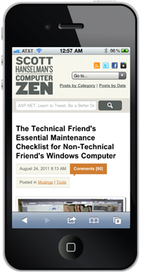
_thumb.png) I blogged about how happy I've been working with designer Jeremy Kratz on my recent site redesign. We've been meeting lately about small improvements and tweaks. One of the core goals was to support many screen sizes from 30" down to a small smart phone screen. You can see the results on the right in a Windows Phone and iPhone.
I blogged about how happy I've been working with designer Jeremy Kratz on my recent site redesign. We've been meeting lately about small improvements and tweaks. One of the core goals was to support many screen sizes from 30" down to a small smart phone screen. You can see the results on the right in a Windows Phone and iPhone.
My team is doing a lot of work on Mobile lately, not just with things like jQuery Mobile and what that means not just for ASP.NET but the mobile web in general. We've also worked with 51Degrees and they've even created a NuGet package that can help you tailor your site to any device. You'll hear more about Mobile in ASP.NET from Steve soon and I'll be sharing some ideas in a few upcoming conferences.
I originally enabled this blog for mobile browsing this same week in 2006. That's 5 years ago, when mobile was really just getting started. Back then, I had a separate mobile view that was stripped down and emitted totally different markup based on user-agent sniffing. This was pretty innovative for the time, a half decade ago. There's a number of things in ASP.NET 2 (what this blog runs on) that do adaptive markup. However, more modern techniques use a combination of detecting capabilities on the server side with feature detection on the client. We query the browser with JavaScript: Do you support Geo-Location natively? No? How about using this shim JavaScript library?
When laying out a page, rather than serving up different markup on the server based on the server-detected browser, we can also use CSS3 media queries that modify a layout based on screen (viewport) size. I wanted to use these techniques for this blog.
While I realize that some people want a totally custom iPhone web application when they visit a site, I draw a specific line between a Web Site, a Mobile Web Site and a Mobile Web Browser Application. When visiting what I consider a regular web site, I don't want an iOS-specific Web version and a Regular Web I can't see. What I'd like to see is the site I went to, perhaps with alternative elements or a few things moved around.
However, if the site is full of interactivity, I might want a Mobile Web Site served up with different - perhaps device-specific - markup for different Smart Phones. I think the decision point for how application-like, and therefore device-specific, your mobile website should be hinges on how much your user will be interacting with it vs. just reading/consuming content.
With this blog, there's not a lot that needs to be smart phone specific. I want a mobile-optimized version of the site, not a complete iOS (or Android, or WP7 or whatever) re-imagination of the site. If I did, I'd download an app.
If you're creating a Web Application that focuses on "producing" (meaning pushing buttons, doing application stuff) I can see using a phone-specific framework, but when "consuming" content, I'd like my Web Site to look like a Web Site.
CSS3 Media Queries
Designer Jeremy and I (mostly him!) came up with a goal to support desktops, tablets and netbooks around 1024 pixels wide, and phones less than or around 720 pixels wide.
Here's the general structure of the CSS. Note that none of this is JavaScript. This is all just descriptive "when the screen is like this, apply these styles" stuff.
/* psuedo CSS, not complete */

/* CSS Reset from http://meyerweb.com/eric/tools/css/reset/

Goes here
*/

/* Global Styles for the Desktop Site */


/* Force the images to resize smaller
   when they get squished with small screens */
img
{
  width: auto !important;
  height: auto !important;
  max-width: 100%;
}

/* bunch of styles */

/* Hide the dropdown we'll use for
   navigation when we are tiny */
#nav select
{
  display: none;
}

/* Tablet device styles */

@media screen and (max-width:1024px)
{
  /* hide stuff, make things smaller, yank the right rail */
  #sidebar
  {
    display: none;
  }
  /* hide other stuff */
}


/* Phone device styles */

@media screen and (max-width:720px)
{
  /* hide the huge top nav and show the nav dropdown */
}
Desktop vs. Mobile Site Navigation
Everything looks nice, until you resize the site and the top navigation bar really got squished, then overflowed. However, Jeremy had a great idea. The navigation at the top is nice, but when the screen is REALLY small the navigation is overwhelming. The navigation is just an unordered list like this:
<div id="nav">
    <ul id="primarynav">
        <li id="nav-info"><strong>Info</strong>
            <ul>
                <li><a title="Learn more about Scott Hanselman" href="http://www.hanselman.com/blog/AboutMe.aspx">About Me</a></li>
                <li><a title="Contact Scott Hanselman" href="http://www.hanselman.com/blog/contact.html">Contact Me</a></li>
            </ul>
        </li>
    <ul>
    ...more..
</div>
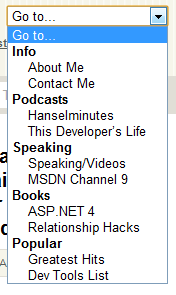
Why not show that as a dropdown for tiny screens? There's actually a StackOverflow question on that (did you know Jeremy did the initial StackOverflow design?) I could certainly just put a dropdown in a DIV and hard code it, but since the structure already exists in a UL and I might want to change it in the future as well as avoid duplication, we'll use JavaScript to inject the SELECT into the HTML DOM (Document Object Model).
Basically we just spin through the UL structure and create the select, options and (bonus!) option group using the existing hierarchy.
$(document).ready(function() {
    var markUp = ["<select id='primarynav-select'>"], $li, $a;
    markUp.push("<option value='' selected='selected'>Go to...</option>");
    $("#primarynav > li").each(function(){
       $li = $(this);
       if($li.find("li").length){
         markUp.push("<optgroup label='"+$li.find("strong").text()+"'>");
         $li.find("li").each(function(){
           $a = $(this).find("a");
           markUp.push("<option value='"+$a.attr("href")+"'>"+$a.text()+"</option>")
         });
         markUp.push("</optgroup>");
       }
       else{
         $a = $li.find("a");
         markUp.push("<option value='"+$a.attr("href")+"'>"+$a.text()+"</option>")
       }
    });
    markUp.push("</select>");

    $("#primarynav").after(markUp.join(''));
    $("#primarynav-select").change(function(){ window.location = $(this).val(); });
});
So this,

becomes this, when you resize the browser really small, just by hiding the one and showing the other using the CSS above.

Resizing Images for Small Screens
For an important site that gets a lot of mobile traffic, you would want to use a browser database like 51Degrees that could tell you the size of the screen of a specific phone and the graphics formats (PNG, JPG, transparency or not) so you could resize large images on the server side and return mobile-optimized images. You could have a handler that detects small phones with small screens then resizes and caches images. Perhaps even grayscales them for non-color phones.
In my case, my images aren't that large and it's not that important to me to do server-side resizing. Instead we decided to have the images resized on the client side using CSS like this:
img
{
  width: auto !important;
  height: auto !important;
  max-width: 100%;
}
This says, no matter what other CSS or the markup says, it's important that images resize to 100% but no larger. This was a nice simple solution for those larger photos that I put at the top of each post. Rather than overflowing and clipping against the edge of the phone, then resize. You can see this in action by just resizing your browser.
Here you can see this site on an IPad. Note the right rail has disappeared. On the right, the same post on an iPhone 4 which is 640px wide. See how the image has moved up and is the width of the phone?
You can even use CSS Media Queries, without any JavaScript, to detect iPad orientation, or if the user has an iPhone 4 with high-res retina display vs. a low-res iPhone 3G.
Here's example CSS from Web Designer Wall, credited to Thomas Maier and Cloud Four respectively.
<!-- Detect iPhone4 Retina Display from CSS -->
<link rel="stylesheet" media="only screen and (-webkit-min-device-pixel-ratio: 2)" type="text/css" href="iphone4.css" />

<!-- Detect iPad and iPad orientation -->
<link rel="stylesheet" media="all and (orientation:portrait)" href="portrait.css">
<link rel="stylesheet" media="all and (orientation:landscape)" href="landscape.css">
You can actually test and simulator the orientations locally by making your desktop browser wider than it is tall.
There's still a few things left to tweak, and these techniques only work with modern Smart Phone browsers that support these features, but for the 8% of you who are reading this blog on a mobile device it should be a better experience now.
One Caveat - Code Samples
As with all nice things, there is one bad thing. The code samples that I have use SyntaxHighlighter. It takes a <pre> and using JavaScript does a lot of work on them, effectively replacing the PRE in the DOM with a bunch of stuff. This looks lovely in a desktop browser and crappy on mobile. I'm still exploring how to fix this. Here's some ideas I have.
- Conditionally override the SyntaxHlighter CSS using Media Queries
- Change the plugin to keep the <pre> around, but hidden. Then swap the highlighted one with the plain one on phones
- Come up with better CSS all up for the highlighter
I'm interested in your thoughts!

Related LInks
- How To: Add Mobile Pages to Your ASP.NET Web Forms / MVC Application
- 51Degrees on CodePlex
- CSS Media Queries on Web Designer Wall
- Tailoring your Blog to your Readers' Browsers
© 2011 Scott Hanselman. All rights reserved.


