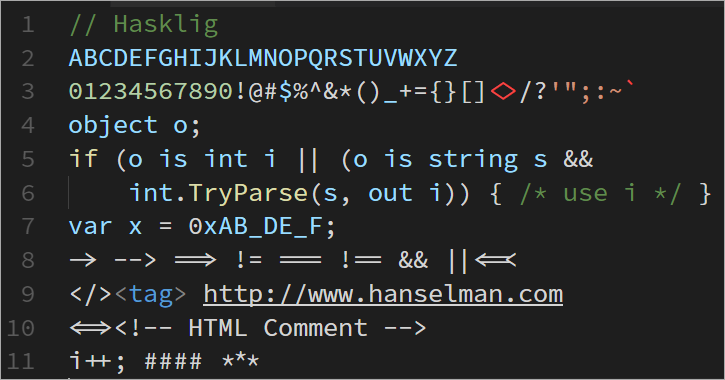
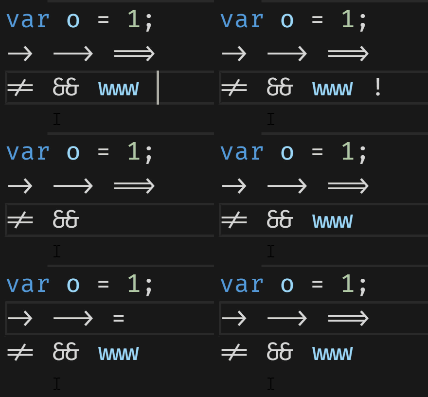
 Typographic ligatures are when multiple characters appear to combine into a single character. Simplistically, when you type two or more characters and they magically attach to each other, you're using ligatures that were supported by your OS, your app, and your font.
I did a blog post in 2011 on using OpenType Ligatures and Stylistic Sets to make nice looking wedding invitations. Most English laypeople aren't familiar with ligatures as such and are impressed by them! However, if your language uses ligatures as a fundamental building block, this kind of stuff is old hat. Ligatures are fundamental to Arabic script and when you're typing it up you'll see your characters/font change and ligatures be added as you type. For example here is ل ا with a space between them, but this is لا the same two characters with no space. Ligatures kicked in.
OK, let's talk programming. Picking a programming font is like picking a religion. No matter what you pick someone will say you're wrong. Most people will agree at least that monospaced fonts are ideal for reading code and that both of you who use proportionally spaces fonts are destined for hell, or at the very least, purgatory.
Beyond that, there's some really interesting programming fonts that have ligature support built in. It's important that you - as programmers - understand and remember that ligatures are just a view on the bytes that are your code. If you custom make a font that makes the = equals site a poop emoji, that's between you and your font. The same thing applies to ligatures. Your code is the same.
Three of the most interesting and thoughtful monospaced programming fonts with ligatures are Fira Code, Monoid, and Hasklig. I say "thoughtful" but that's what I really mean - these folks have designed these fonts with programming in mind, considering spacing, feel, density, pleasantness, glance-ability, and a dozen other things that I'm not clever enough to think of.
I'll be doing screenshots (and coding) in the free cross-platform Visual Studio Code. Go to your User Settings (Ctrl-,) or File | Preferences, and add your font name and turn on ligatures if you want to follow along. Example:
// Place your settings in this file to overwrite the default settings
{
    "editor.fontSize": 20,
    "editor.fontLigatures": true,
    "editor.fontFamily": "Fira Code"
}
Most of these fonts have dozens and dozens of ligature combinations and there is no agreement for "make this a single glyph" or "use ligatures for -> but not ==> so you'll need to try them out with YOUR code and make a decision for yourself. My sample code example can't be complete and how it looks and feels to you on your screen is all that matters.
Here's my little sample. Note the differences.
// FIRA CODE

object o;

if (o is int i || (o is string s &&

    int.TryParse(s, out i)) { /* use i */ }

var x = 0xABCDEF;

-> --> ==> != === !== && ||<=<

</><tag> http://www.hanselman.com

<=><!-- HTML Comment -->

i++; #### ***
Fira Code
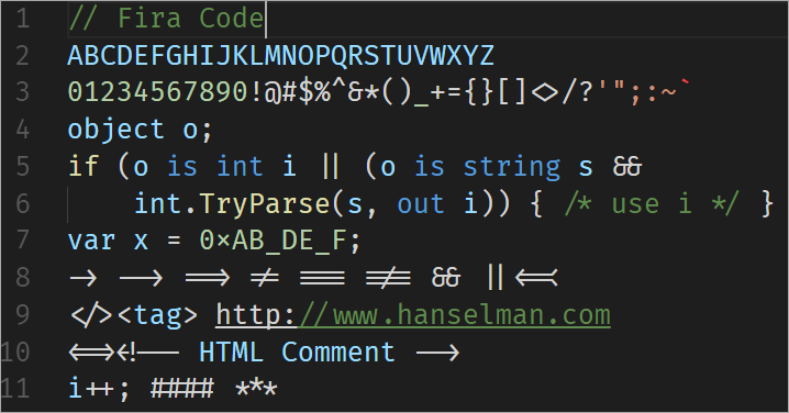
There's so much here. Look at how "www" turned into an interesting glyph. Things like != and ==> turn into arrows. HTML Comments are awesome. Double ampersands join together.
I was especially impressed by the redefined hex "x". See how it's higher up and smaller than var x?
Monoid
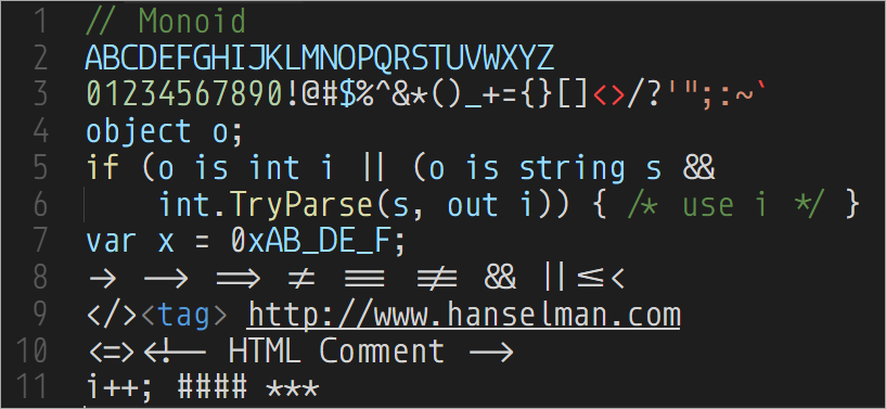
Monoid prides itself on being crisp and readable on retina displays as well as at 9pt on low-res displays. I frankly can't understand how tiny font people can function. It gives me a headache to even consider programming at anything less than 14 to 16pt and I am usually around 20pt. And my vision is fine. ;)
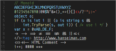
Monoid's goal is to be sleek and precise and the designer has gone out of their way to make sure there's no confusion between any two characters.
Hasklig
Hasklig takes the Source Code Pro font and adds ligatures. As you can tell by the name, it's great in Haskell, as for a while a number of Haskell people were taking to using single character (tiny) Unicode glyphs like ⇒ for things like =>. Clearly this was a problem best solved by ligatures.
Do any of you use programming fonts with ligatures? I'm impressed with Fira Code, myself, and I'm giving it a try this month.
Sponsor: Thanks to Redgate! A third of teams don’t version control their database. Connect your database to your version control system with SQL Source Control and find out who made changes, what they did, and why. Learn more
© 2017 Scott Hanselman. All rights reserved.
