DISCLAIMER: This is my opinion. I don't work for the Visual Studio Team. If you write an article about this and quote me as "The Principal Program Manager for Something Major" then you are a silly person.
 The next version of Visual Studio is being worked on and the Beta is coming out soon that we'll all get to download. The Visual Studio design team put a post out today called "Introducing the New Developer Experience" and many of the comments are negative. Some folks are freaking out about the colors and the icons.
Because the first blog post from Visual Studio was on the new look and feel (and because everyone is Metro-styling everything) the public perception is that no work has been happening except the icons and colors have changed.
This is my blog, not hosted, run, organized or written by anyone but me. My post, my blog, my opinions. My initial reaction to the redesign was who moved my cheese? Why are we making everything gray? But I've been running this for a few weeks and I have some perspective even though I'm not on the Visual Studio team (I work on the web team).
There's basically three issues here as I see it.
- First, the new look of Visual Studio.
- Second, look side, what actual new features are in the new Visual Studio.
- Last, what this new look means to Windows applications and app design in general
The New Look
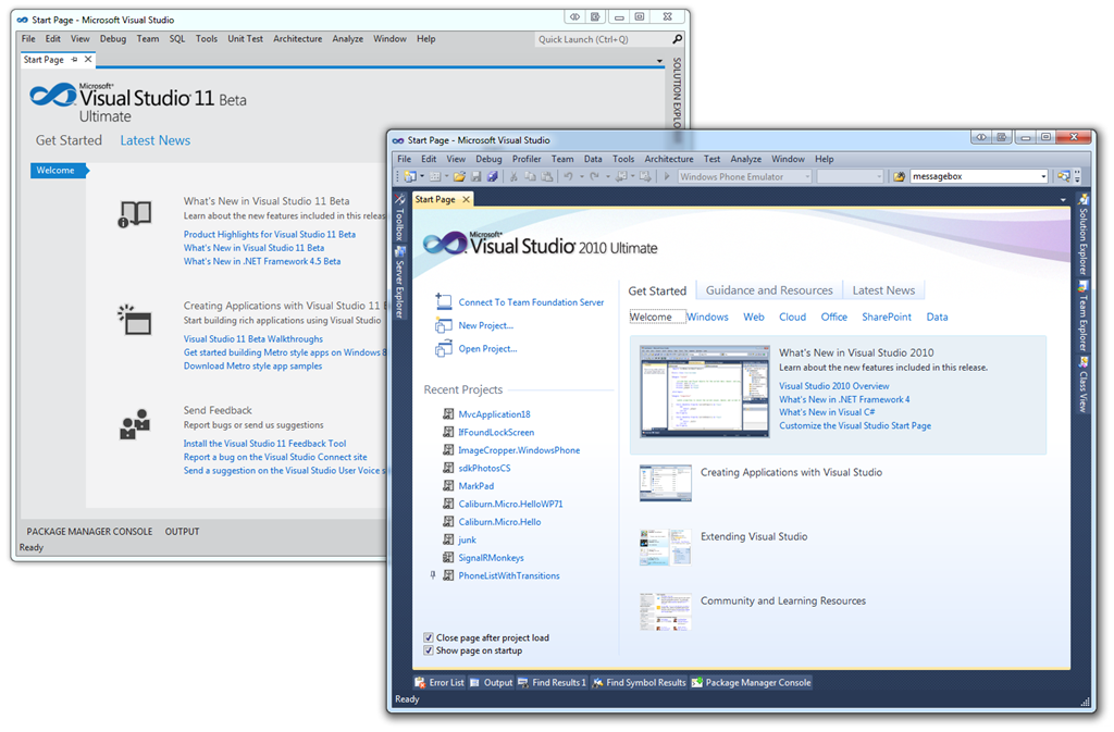
It's dramatic. It's initially gray. There is a light theme and a dark theme. Here's the VS11 next to VS10. It's still Visual Studio, so that's something, but the skin has changed.
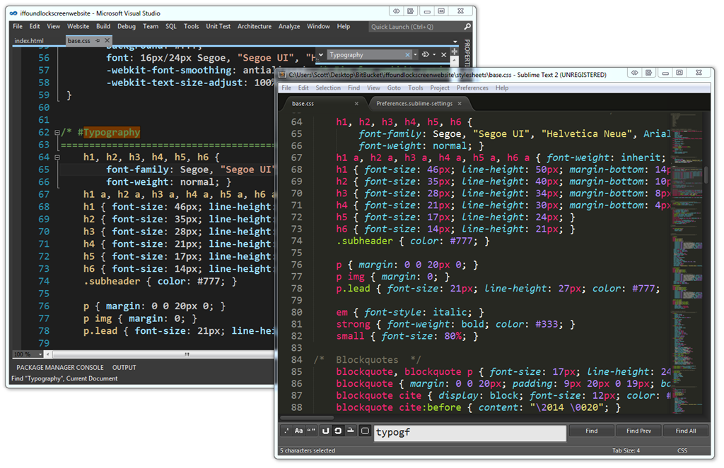
The dark theme in Visual Studio 11 looks a lot like my current Text Editor of Choice (and the new hotness everyone is talking about) Sublime Text 2. Here are the two side by side. They are pretty similar. There's only so many ways you can make a minimal UI with a text editor, line numbers, a find dialog and a scrollbar. I actually blogged about simplifying your Visual Studio 2010 a while back. Just turn the toolbars off. You don't need them. In fact, the Web Team (the team I'm on) has a simplified Code View that we've had available since VS 2010.
See how Visual Studio looks very different below than it does above? It's customizable so you can get a number of weird looks. I also blogged about how to change your themes and make VS 2010 look like 2008 here. Also, did you know about http://studiostyl.es? It's a growing list of themes for Visual Studio. There's hundreds. I called some out in my Visual Studio Programmer Theme Gallery.
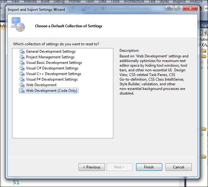
In VS10, today, you can switch your IDE to Web Development (Code Only) from Tools | Export Settings | Reset and you'll get this dialog. That will hide all your tools windows, and extra stuff in the Visual Studio you already have. This feature has been there for years because folks asked for it. This is the same list that you are offered the very first time you launch Visual Studio. It's a nice way to "tidy up" Visual Studio today. Of course you can change the colors and generally mess about as you like.
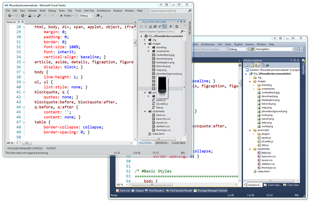
Here's VS11 and VS10 next to each other. VS11 shows a preview of images if you hover over it.
Personally, I don't like the ALL CAPS much. I'm sure they have heard that feedback from a lot of people. That's just one man's opinion but I'm not too worried about it. I know the Visual Studio design team is collecting everyone's on their blog and I encourage you to comment there so they see it.
The colorful Visual Studio icons were changed to glyphs. Glyphs are apparently a designer term for icons that are not colorful. You can see a lot of glyphs at http://thenounproject.com and I used a lot in my recent Windows Phone 7 application. We're used to seeing glyphs in Windows already, like in the "tray" by the clock. (Yes I know it's not called The Tray.)
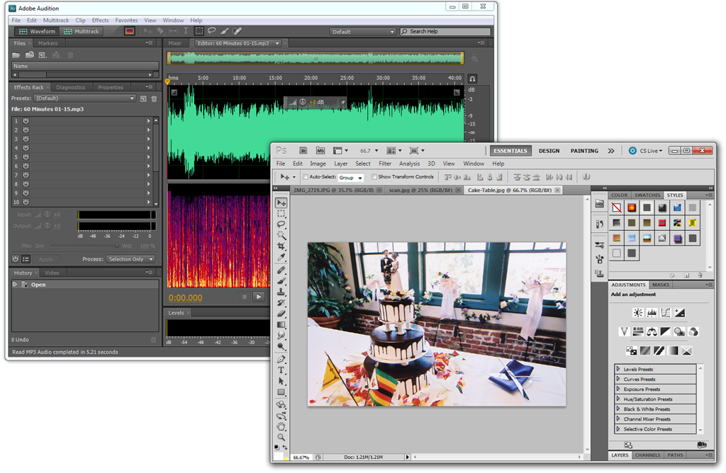
I'd like a little color in my icons, but I don't think they all need to be full color. Just include a splash so I can tell them apart. For example, here's my copy of Adobe Audition next to Photoshop, both from my same machine. Notice that there's some color in important buttons in Audition and very very minimal color in Photoshop, but mostly grays. There's still room for splashes of color in black and white glyph style icons. The idea is to make the icon get out of the way, but also be "scannable" so that I can remember not only where it is, but if it moves still scan and get to it quickly.
In Photoshop I'm editing color photos and in Audition I'm editing a colorful waveform. In both editors the UI is getting out of the way of the thing I'm editing. I like the idea of my editor being less important than the thing I'm editing.
New Features
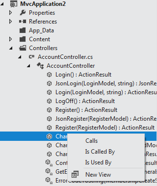
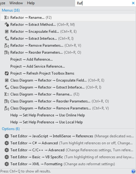 There are a pile of non-UI/UX features in Visual Studio 11 that are broad and systemic changes that aren't just changing colors. I’m finding it easier to locate the commands and options I need due to the new search features and toolbar reductions I mentioned above. I find myself exploring relationships in my code with the new Solution Explorer without having to switch tool windows like I use to. I also find that unlike in the past when the files I needed to focus on kept getting crowded out by lots of open stuff I didn’t need now I keep looking up at my open tabs and seeing only the stuff I care about. It's hard to express this without spending hours inside the IDE. There's bug fixes, speed fixes and memory fixes.
Non-theme-related work that the UX guys are doing cleans up the UI and improve it's functionality without removing features. When you consider only the more commonly used toolbars (Standard, Debug, Text Editor, Work Item Tracking, Test Tools), they've removed 60% of the clutter and globally there's 35% fewer commands in the toolbar in VS11, but all the features are still available. The stuff that has value is up front and easier to find and the obscure stuff I can search for with one hotkey. Don't let talk of icon colors (or lack of) detract from actual thought that's been put into a developer's (in my case, a web developer's) daily workflow.
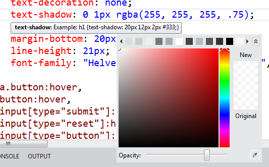
My team (the angle brackets folks) has talked about the features and fixes in ASP.NET, IIS and related tech on videos and tutorials up on http://asp.net/vnext and will keep updating that mini-site. All the editors have been updated with features like goto definition in JavaScript, color pictures and vendor prefixes and piles more. All added features, but done in a clean way that gives you useful functionality without adding more windows and widgets.
You'll get your hands on the Beta very soon. It's not too late to get or give feedback. All the teams are listening and I'm making sure that your voice (and mine) are going to the right people. To dismiss all the CLR work, the BCL work, the speed and meory footprint work over some icons is premature. Does it work?
Is this Metro-style?
As far as the design, I think that there's a lot more interesting work going on in Windows application design now in everyone's applications. No, not everything is or has to be "Metro-style." It does need to be thoughtfully designed, though. We've seen that in phones and on desktops. We're starting to see applications with design at their heart.
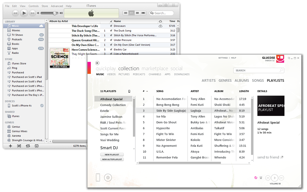
 I'm enjoying seeing what's coming next. There's a lot of interesting conversations around the web right now about what all design thought means for Windows, for Office, and for applications in general. Ars Technica has an interesting blurb that talks about an "elegant fusion of ribbon and Metro."
Is Visual Studio a metro-style application now? No. Is Zune or Sublime or iTunes or Photoshop? Of course not. I think the larger more interesting discussion is an increased use of whitespace, of design languages, of "content over chrome," of fewer lines, fewer wasted pixels and clearer spaces, of form meeting function. For now, Visual Studio is Beta, and it will look likely different when it's released. But it is being designed.
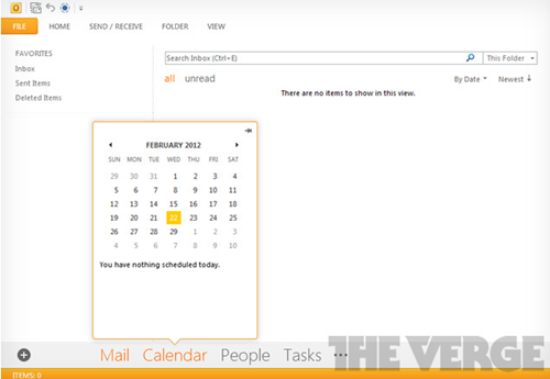
The Verge has some screenshots of some early builds of Office 15 and how it might look. I like our they to use color purposefully within the design. It's early to pass judgment on any of these applications, but I think I understand what all these designers are trying to accomplish. They don't (and I don't) want color and bling and flash in the outside application chrome if it doesn't provide information about my content. It's like what Tufte says, make those pixels work for you. Sure, one can blindly "Metro-style all things" but I would rather think of it as a applying design principles like clean lines, appropriate use of whitespace and focus on the the content (in this case, code). This beta is a step in that direction. I'm sure it will improve as feedback comes in.
VS and Me
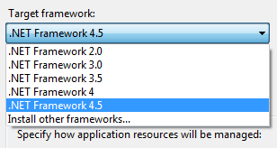
There's style and there's functionality. So far I've been very happy with the functionality of VS11 and have been writing all my code in it. It opens VS2010 projects without converting and I can round-trip between VS11 and VS10SP1. I can create and target .NET 4.5 apps as well as.NET 2.0 apps. So far VS11 has been faster on my machines than VS10, and since I have more than one processor, I get multi-processor builds automatically. The editor is fast and the builds are fast.
It's far too early to panic. Sure, my cheese has been moved, but I can always change the colors or toolbars. I just want a faster, cleaner, more productive system that focuses on the code.
My advice to you? Go follow the updates on the Visual Studio blog. Keep adding your comments, and check out their new Visual Studio posts each day including the one they just posted today about the Solution Explorer hub. But above all, download it on launch day, use it for a while and see what you think.
© 2012 Scott Hanselman. All rights reserved.