Sometimes good UX is about being clever. Sometimes it's to make the user happy or smile. However, when the success of your product depends on new, possibly inexperienced users successfully downloading and installing it, good UX is the difference between success and failure.
I love what Dropbox has done here. I've noticed it for years and mentioned it in talks and to friends but I wanted to call it out here because it's so thoughtful.
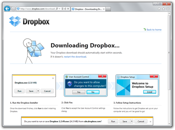
When you go to download Dropbox, here's what you see on Internet Explorer. Note they've used a three step tiny screenshot sequence. Each of them isn't a real screenshot, but rather "evocative" of the thing an IE user would see. For example, the second User Access Control dialog isn't real, but it's close enough that it makes the point while still fitting into width of the page cleanly. Their Welcome to Dropbox Setup screenshot is the same way, distilling the essence of what's coming while keeping the design consistent.
See below how the first screenshot shows what's coming and looks enough like the actual Save As experience that pops up seconds later as to guide the user to the next step.
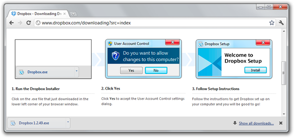
Here's the attention to detail part. Here's what a Chrome user sees when downloading Dropbox. They see a Chrome specific download screenshot.
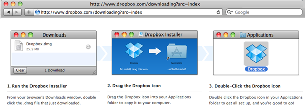
Here's the Dropbox download page when using Safari on a Mac:
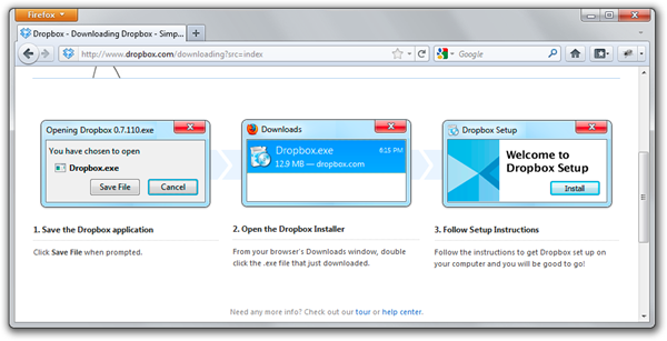
In Firefox for Windows, they see a Firefox Save File dialog along with a different second step. In the second step Dropbox takes a chance and doesn't show the User Access Control screenshot, and is instead more concerned that the user will download the file but not run it. I've had this happen myself with Firefox a few times, where things get downloaded then forgotten.
Techies forget how something as trivial as downloading and running a file can be a huge deal for the average user. What Dropbox has done here is a nice touch over the standard big Download button. To accomplish something like this, not only did they need the initial idea but they needed to the will to do it. They thought it'd be useful and they made it happen. What can we do in our organizations, Dear Reader, to sell our innovated ideas up the management chain and make the happen? What kinds of things stand in our way? What do we tell ourselves? That's too hard, that's too involved, that's too difficult to test, and the list goes on.
We need to continue to push ourselves and our work groups to implement ideas that we know are right. We need to advocate for the Customer and always try to see things from their experience. I don't know anyone at Dropbox but I think it's a fair guess that not only did they have the will to implement this friendly download feature, but they also knew it was the right kind of attention to detail that their customers needed. What a nice, almost subliminal way to kick off your relationship with your users than a subtly customized download page.
Have you done something similar, Dear Reader? Share in the comments.
© 2011 Scott Hanselman. All rights reserved.


